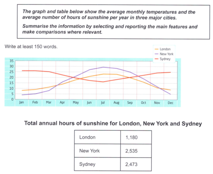
The line graph illustrates average temperatures in London, New York, and Sydney on a monthly basis and the table provides information about the total annual hours of sunshine in these three metropoles.
Overall, what stands out from graph is that the weather patterns in New York and London were very similar while that in Sydney experienced an opposite trend; nonetheless, the yearly temperature variation of Sydney was far smaller than that of the other two cities. Another significant point is that the average sunshine durations in New York and Sydney were far higher than that in the remaining city.
Regarding the temperature curve in New York, it started at a low of 5 degree in January, increasing gradually over the first quarter before rising rapidly to reach its peak at almost 30 degree in July. Afterwards, there was a significant drop to its January mark by the end of the year. Likewise, the city of London started the year at approximately 10 degree, which was twice as high as that in New Work at the same time, and then, the figure climbed gradually to peaked at roughly 24 degree. At this point, it stayed constant for 1 more month before falling dramatically to its starting point by December.
By contrast, a reversed weather patterns were experienced in Sydney where the temperature was at its record high in January at over 25 degree. Following this, there was a slight fall to around 15 degree in the middle of the year and then the weather quickly recovered to its warmer state towards the end of the period. As for the total annual hours of sunshine, New York topped the list with 2,535 hours, followed by Sydney with a slightly lower figure (2574 hours). The duration of sunshine in London was about half of that, at only 1,180 hours per year.
